I have a hard time making up my mind when it comes to my own self. I can suggest three things to a client that they should do or recommend that they go a particular course. I’ve never been one for logos or tying myself to any one particular image. There are many facets to what I do, so why not have a few? And why not let the community help me decide?
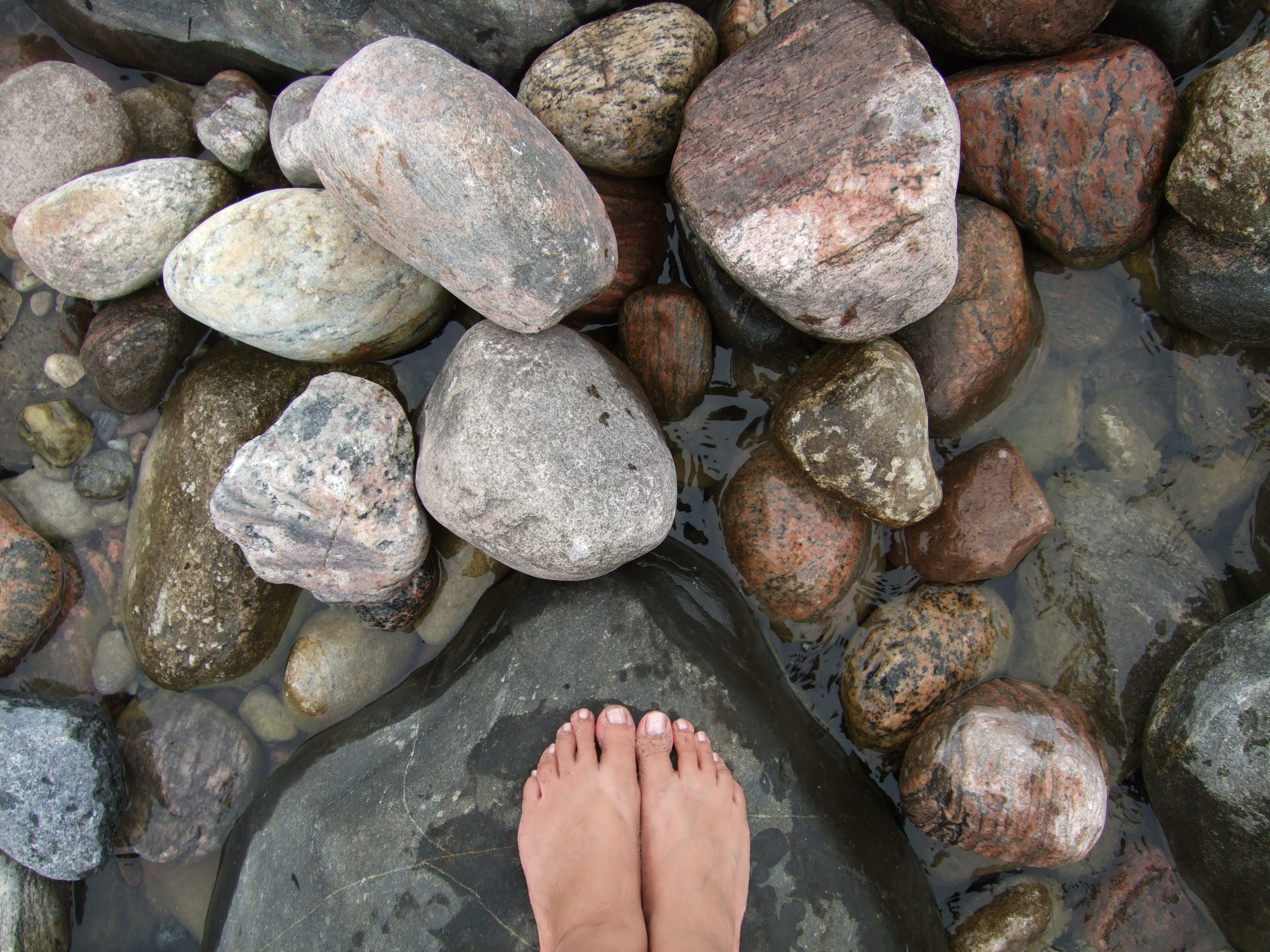
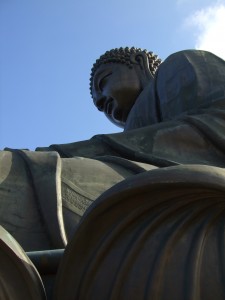
I’ve needed business cards for sometime now, but don’t consider myself a designer. I love photography, so I’m using four images on the backs of my business cards:
I’m basing this experiment after seeing Alex Blom with his three different colours of cards when I first met him a few years ago. Why not try this with my own photos?
There are a few things that I hope to find out from this little experiment:
- Which card appeals to everyone? The one that I run out of first, is the most popular.
- Which card gets the most click-throughs? Each card is coded with a different QR code that links to their respective campaign in Google Analytics. The one that gets the most click-throughs, might be my second option.
- I’m also curious to see which people pick which photos. I have a small theory about which ones women will pick over the men, but I’ll share that once I know the results to see if I’m right. Don’t want to skew the results.
Anything else I should be finding out? What do you expect to see?


One thought on “A Little Experiment”
Comments are closed.